inVentiv Health Communications 29 Jul 2015 // 1:48PM GMT

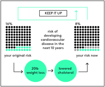
This graphic,developed by Robert Wood Johnson and University of Michigan as part of their by the Visualizing Health project, tells the story of how a person’s risk changes from the higher on the left to the lower on the right due to lifestyle alterations. The core message (“keep it up”) is placed top and center, rather than buried underneath the data.
As a scientist turned PR professional, I can attest to the power of pictures. Even as I completed my experiments in the lab and crunched the numbers, I knew that the greatest insights I would gather would be after I graphed the results and studied them carefully. As a human being, you are hardwired to have a penchant for pictures. Almost 50 percent of your brain is involved in visual processing. You can get the sense of visual scene in less than 1/10 of a second. In contrast, reading involves scanning the characters, putting them together to make words, and then sentences.
The healthcare industry generates vast amounts of information through clinical trials, electronic health records and genomic and biometric data, among others. In this era of “big data”, visualization provides real value by helping researchers find trends, expose outliers, and provide actionable insights to patients and their healthcare providers.
In a growing trend, individuals can visualize their personal data to make sense of their own experiences, such as their spending patterns, sleep and exercise habits or even their social media behaviors. Companies like Quantified Self and PatientsLikeMe are helping people not only capture, graph and understand their own data, but are pioneering the sharing of patient generated information like what they ate, their mood, exercise levels, how they felt, and whether they adhered to their medication regimen with their physicians. Called “observations of daily living”, such data could help people better manage their conditions and may eventually support physicians in improving care.
So in this age of data visualization, why do we as health communicators still develop 1500 word press releases to convey the most important information? The next time you disseminate survey data, consider visually representing it by state, age or gender, and allowing your audience to interact with the results. This not only increases engagement but retention of information. Consider providing a historical perspective to the disease state you are championing. For instance, with the advent of new lifesaving oncology products, has life expectancy increased in the past 10 years? Can that be graphically displayed?
And keep the following tips in mind when developing knockout visuals to explain your data as part of your public relations mix:
- Identify your target- is it a reporter? physician? patient?- what would they like to know?
- Don’t let visuals obscure the point you are trying to make. Good visuals incite the viewer to think about the content rather than the design
- Encourage the eye to compare different pieces of data to come to conclusions
- Accompany visuals with headings or corresponding short narratives. Remember that captions are generally read before an article.
- And don’t forget to take inspiration from the amazing graphics developed by the Visualizing Health project which explain health risk information and were tested to ensure that they are effective with the general public (see example above).
By Cynthia Isaac, Ph.D.













.jpg)
